I'm taking a short break from posting concept art and spec work that never got used to post some work that is actually going very well. I think the art below is pretty close to what the final website will look like. Some of the sidebar assets might change a little. 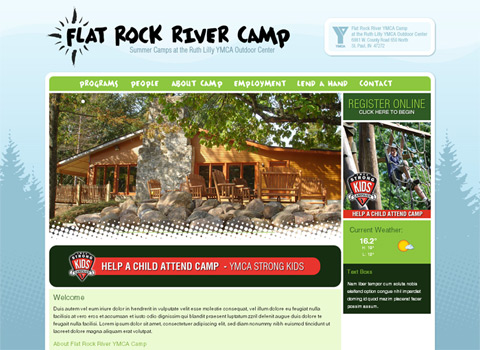
This is the site design for the Flat Rock River YMCA Camp. We did their old site and now it's time for something new. Omega's working with an agency here in town called Pearson Partners to develop this project. It took a few failed attempts to finally nail this down, bit I'm really pleased with the end result.
I worked up a new logo that references the compass rose design of the old site, it's a little looser then the old version. This is the only thing that could potentially change, since they have a few different logos now. Hopefully we can convince them to move over to this one. It's laid over the background to the site.
This site uses my flash based content slideshow thing. I have versions that use an opacity tween to fade between the photos/slides and a version that uses a mask to do a more complicated transition. This one uses the masking effect to create a sweeping halftone pattern for the transition. A second version of the app is going to run promos and topical content where the Strong Kids banner currently is.
