Most of the guys at Prodigy liked the "bullet P" logo, but unfortunately the boss was not feeling it, so here is the second try: 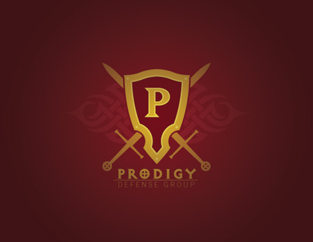
Obviously about an 180° departure from the first one. This isn't 100% final, I'm not quite feeling the P letterform in the center yet. Might need to be a different font (currently a version of Matrix), I'm trying to stay away from Old English/Blackletter if I can possibly help it. It's got some cool things going on though, and I'm pretty happy so far. This will probably have a more detailed, painterly, version coming along in the not to distant future.
