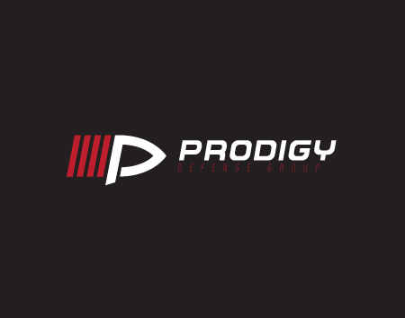
After six and a half designs and versions of the Prodigy logo, many of which I didn't post, they have finally decided on one they liked. Yay!
Seen here:
This is actually a "italicized" version of the very first design I sent them. I like the skewing of the art as it adds a little motion and interest to the piece. I had played with that idea a little when I was first making the original. The approach was a little off so it never really came out like I wanted. Over all there was really only one idea that I sent over that I really didn't like.


